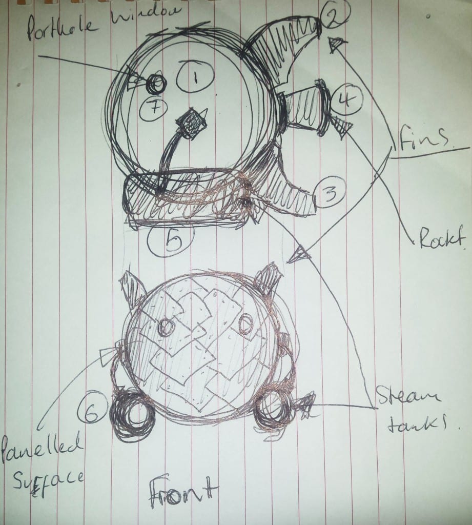
In a meeting with my tutor in week 10, we came up with the sketch on the top as design for the ship. It has steampunk elements, such as the exhaust, labeled as ‘number 4’ and ‘Rocket’
on the sketch, the steam tanks and even the design for the
fins. The fins and the exhaust were inspired by this design for a
steampunk rocket.
Before I did my proper research on this piece, I thought that it
was an actual physical model of a wooden space rocket. It turned
out that this is a 3D model, which just goes to show how important
good textures and good lighting are for the photo realism of
3D models. The American company that made this 3D model is
called Reimage and is situated somewhere not far from Atlanta.
Unfortunately, they did not write any information on their blog as
to how they did it, how long it took or what software they used.
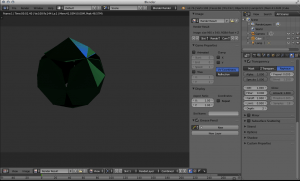
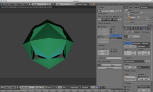
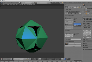
23 I started with the ship’s most prominent shape, a sphere. The
main idea was to combine Steampunk with Sci-Fi elements to
create an interesting space ship with a lot of potential for texturing.
The sphere would look a little too plain if just left like this,
so we decided to make it a panelled surface, which also helps
to combine the two main styles. To do that I followed this short
and easy tutorial, that solely uses Blender modifiers. So the steps
were : Go into Edit mode, select the edges you want to be the
edges of your panels, then press CTRL + E and choose ‘Mark
sharp’. Tab out of Edit mode and go to the modifier menu and
add the ‘Edge Split’ modifier, untick the ‘Edge Angle’ box. The
previously selected edges can now be seen on the model. After
that you just add a ‘Solidify’ modifier and a ‘Bevel’ modifier, turn
‘Auto smooth’ on and tell the Bevel modifier to use angle offset.
This was a really easy way of creating a panelled surface, which I
always thought would be a rather complicated and time consuming
process. This technique of creating a panelled surface certainly
worked, but has created several problems with the texture
afterwards.
The workfLow
My tutor helped me to understand how much work I had in front
of me and how little time, by writing down what the workflow
and schedule would look like for a CGI showreel.
Week 11
Monday -> Wednesday Complete mesh
Thursday -> Friday Texture Paint
Week 12
Shooting footage + matchmove
Week 13
Render + edit
3D workflow
3d model + UV unwrap in Blender
Export fbx file to Substance Painter
Paint in Substance Painter
Export bitmaps to Blender
Import model , textures into matchmoved footage
into Blender
24
I’m not sure how it confuses the computer softwares, but UV
mapping in Blender as well as in Substance Painter was quite a
challenge. The light gets reflected in very odd ways because of
the panels, which I only came across far in into the work process.
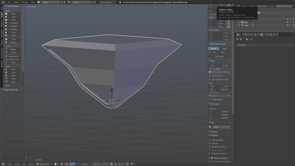
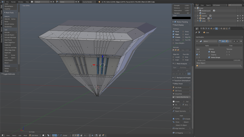
I wasn’t sure how I should build the fins, because I had to make
a fairly round object out of a cube. So the method I chose, was
the ‘stamp method’ with the help of a Boolean operation. This
worked alright, but created fins with an unbelievably high face
count, which, besides me using a subdivision surface modifier on
everything at that time, in the end crashed my computer several
times and made Blender sheer unusable. There were also problems
with the side faces of those fins. If you look closely on the
picture above you can see several triangular white flares on the
model. I couldn’t get rid of it and so I had to redo them by scaling
and creating edges, which were dragged into place, in the
end.
I had to learn the hard way that the Subdivision Surface modifier
makes everything look pretty and nice, but really is not a good
idea to use. I haven’t used it since, and have now learned, after
completing a model with texture, that textures dictate the look
of the model, not the smothness of the mesh.
W ith this many faces
you would even crash
a Pixar computer and that
is quite a skill to have!’
26 I then proceeded to add to the model and built pipes, tanks and
the exhaust. For the exhaust and the tanks I used a simple cylinder.
To build the exhaust, I selected the top face of the cylinder
and extruded it outwards, which I also scaled to create the raised
‘step’ where the exhaust ends. Then I extruded the top face inwards
to create the hollow effect of a tube and scaled the face to
give the tube an even thickness. To finalise this mesh, I bevelled
the edges in order to make it look less computer generated and
more handmade.
Now the way I extruded my meshes somehow messed up the
normals. This wasn’t visible in Blender, but showed when I
imported the fbx file into Substance Painter. The problem that
the messed up normals created was, that some of my objects
were half see-through, unfortunately I forgot to take a screenshot
of that mistake but you can imagine it as having the mesh,
with paper thin walls, cut in half so that you can see the inside. I
first noticed this phenomenon on the exhaust, so we tried to find
out what it was. We looked at the UV mapping, to see if the bug
was there and came to the conclusion that the UV maps were
alright.
Jon then looked at the normals of the mesh in Blender and it
turned out that the normals were all over the place. This could
be easily fixed with simply clicking on ‘recalculate normals’ in the
menu on the left. I exported the file anew as fbx and imported it
into Substance Painter. The transparency had disappeared from
the exhaust, but then I noticed that the tanks and pipes had the
same problem. So I went back into Blender to check the normals
of those meshes and they were all over the place same as the
exhaust’s earlier. So I recalculated the normals of every mesh,
imported it into Substance Painter and had fixed that little problem
with only a few clicks.
Before I knew about the normals mishap I first UV unwrapped the
model and made sure that the square pattern on each mesh is
roughly the same size. I remembered most of the steps of UV unwrapping
from the Unreal Engine 4 workshop and the microchip
model that I made previously to this one, but if I did get stuck I
looked at a UV unwrapping tutorial from the curious engine.
28 After debugging the model and making sure that everything is
in place I imported the final fbx file into Substance Painter. Substance
Painter is a rather easy to use texture painting software
that works very similar to photoshop with its layer system. I again
followed a tutorial series from the curious engine, about how to
use Substance Painter and add different levels of detail and dirt
to the model. I chose a dark red as the main colour for the ship,
because in colour theory red represents many things such as war,
danger, strength, power, determination as well as passion, desire,
and love. Dark red specifically represents willpower, anger,
courage and wrath, which are all traits and words associated with
a dystopian future and therefore it fits the overall theme quite
well.
I played around with the colours of each mesh and created my
own copper material to use it on the pipes, tanks and exhaust. I
got feedback that the yellow fins don’t work too well with the design
and the idea of the ship and that my copper could use a few
tweaks because it looked like rose gold, instead of copper. The
yellow fins make the ship look like a toy, that’s why I decided to
make the fins the same material as the main body and it makes
28
sense that in a dystopian future, you wouldn’t spend money on a
different colour to paint your space ship. I added dust and a lot
of leakage and rust to give the ship a story and make it interesting
to look at. The copper I used in the end was a smart material
from Substance Painter which looked weathered and oxidised
and was exactly what I needed.
I then exported the textures and normal maps and introduced
them back to the model in Blender with the help of a Simple PBR
shader that I found on the internet. It really made it much easier,
because all you had to do is create an Image Texture, upload the
texture bitmaps, such as Roughness, Metallic, Normal map, etc.
and plug it into the shader.
I mentioned earlier that the panelling created problems with
the texture. This problem is depicted below. It turned out that
the normal map is too strong and that all I had to do was turn
it down from 1000 to 200, which I have done in every tracking
scene for every texture.
After my textures seemed to work fine in Blender I went out to
shoot some footage that I could track. I learned that tracking
footage needs to be one very smooth movement and preferably
a forward or backward movement. I have really shaky hands and
therefore most of the footage I shot was unusable. I managed
to get roughly 6 seconds out of one shot though, which is still
very shaky, but it wasn’t too hard to track it. I also found a German
website that offers free to use HD footage. I used 2 of them.
They were very easy to track, but I had to convert them from 50
fps to 25 fps with Premiere Pro. Since I had never used Premiere
Pro before I used another tutorial from the curious engine to
help me with it. It was quite easy to follow and done in about 5
minutes.
After that I tracked the footage as I did the test pieces, inserted
the ship in it and let it render. One render started with 2.08 minutes
render time for 1 frame. I calculated that this piece, which
had 250 frames, would take about 8,5 hours to render. The render
time per frame got gradually more with each frame, so in the
end my pieces all took 2 to 3 hours longer than what I calculated.
I recorded my matchmoving workflow 2 times, but I am unable
to link to it in this document, because I haven’t uploaded them
yet. The upload time for one of them was 13 hours, so I’ll upload
them after the christmas break and will put them on my blog.


Recent Comments