Our task for this week is to find good and bad examples of user interfaces. My assigned area is ” energy consumption”.
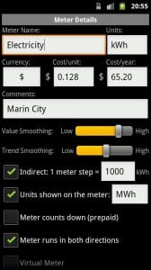
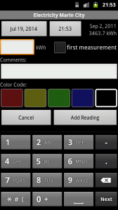
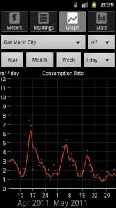
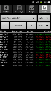
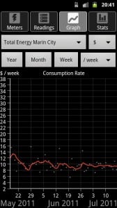
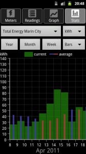
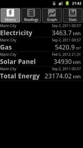
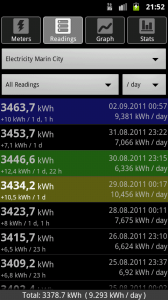
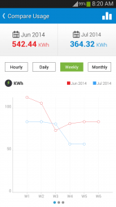
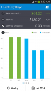
I found a lot of apps on how to save energy and apps that help you to keep track on what you used. I decided to look into apps that help the consumer find out how many energy he used and how much money he spent on it. One App called ” Energy Consumption Analyzer” helps the user to keep track of his energy consumption, it even let’s you add data of your gas meter and water. The idea is very good and probably very helpful, but in this case the design is not the best. It’s dark and there’s too much text and information on it.
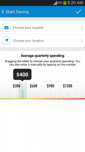
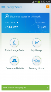
The second app I found is called ” Energy Saver “. The interface design is good. It’s bright and friendly. It’s easy to use and doesn’t slay the user with information.
Recent Comments